Guide · 7 min
2026 · AI startup, Germany
01 — Context
Agentiqa is an AI agent that tests websites and apps the way a real user would: paste a link, the agent clicks through the interface, finds bugs and brings back proof — screenshots, video and steps to reproduce.
Make the product easier to use, create a consistent visual style, and help prepare it for launch.
02 — Scope
The team wanted to stay small, so everything visual went through me — from the first logo sketch to pull requests on the website.
03 — Brand
The main logo, its variations, and examples of how it’s used across the product.
 Primary lockup
 Alternate lockup
 Switch mark
 Tilted mark
 Expressions
 agentiqa
04 — Website
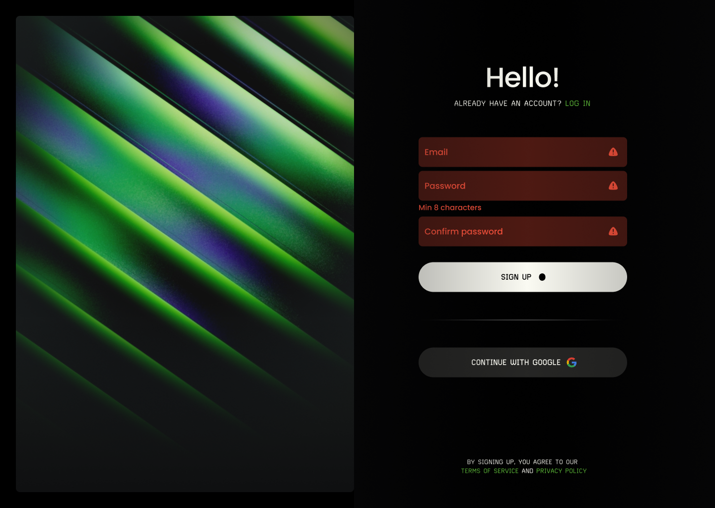
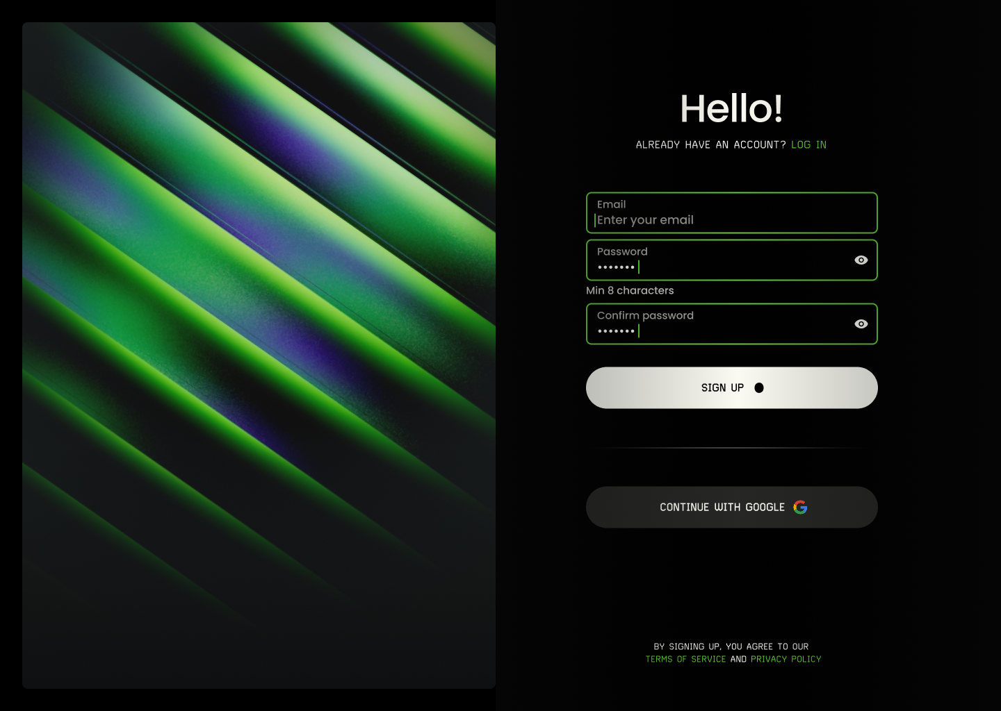
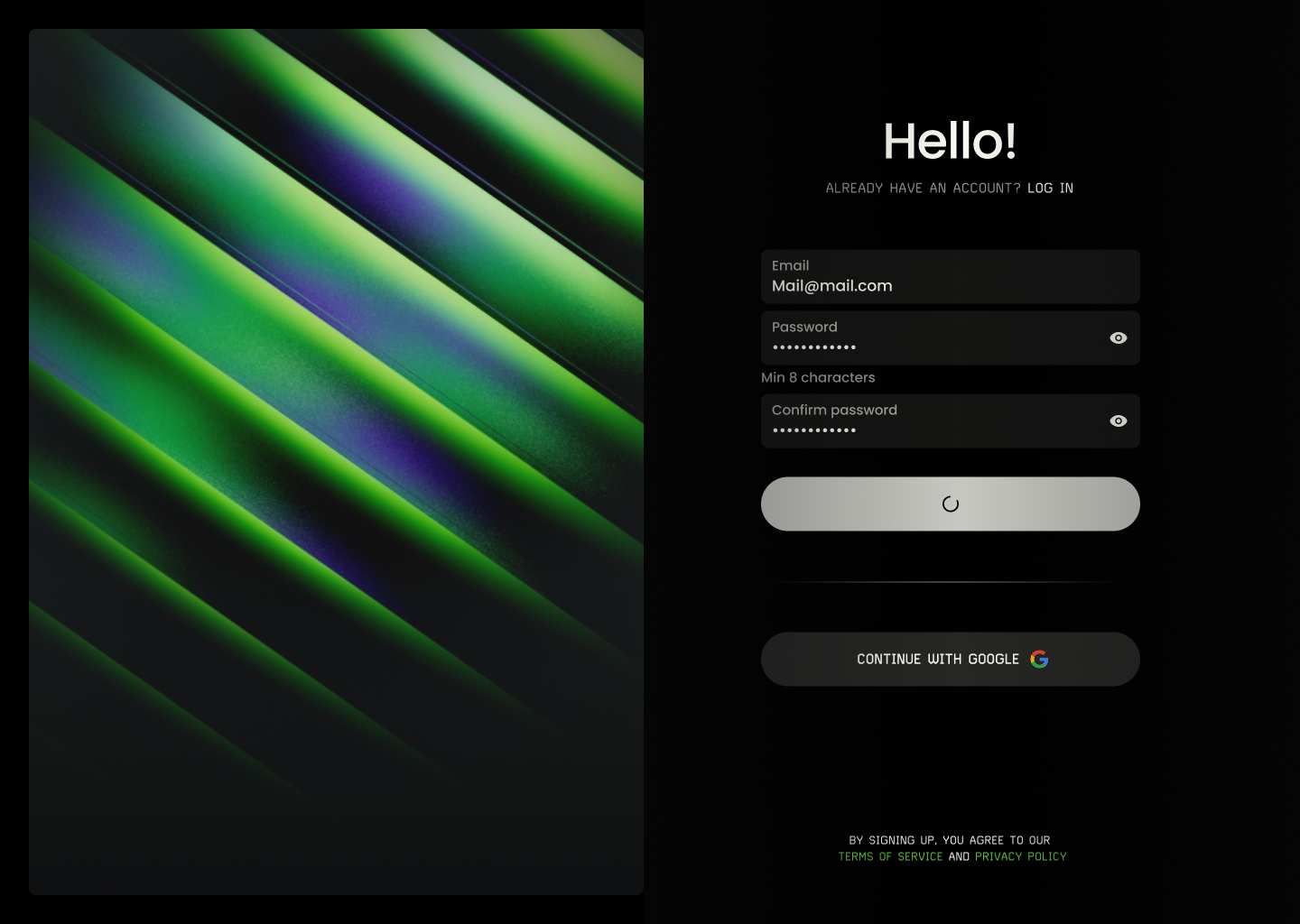
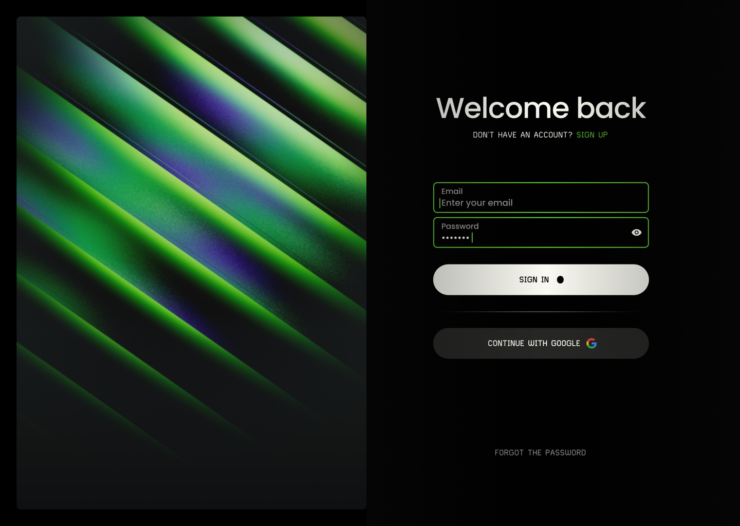
I designed the website’s visual style, graphics and animations, and built a design system for it — desktop and mobile. Once the basic site was live, I kept shipping content updates myself with vibe coding, straight to GitHub.
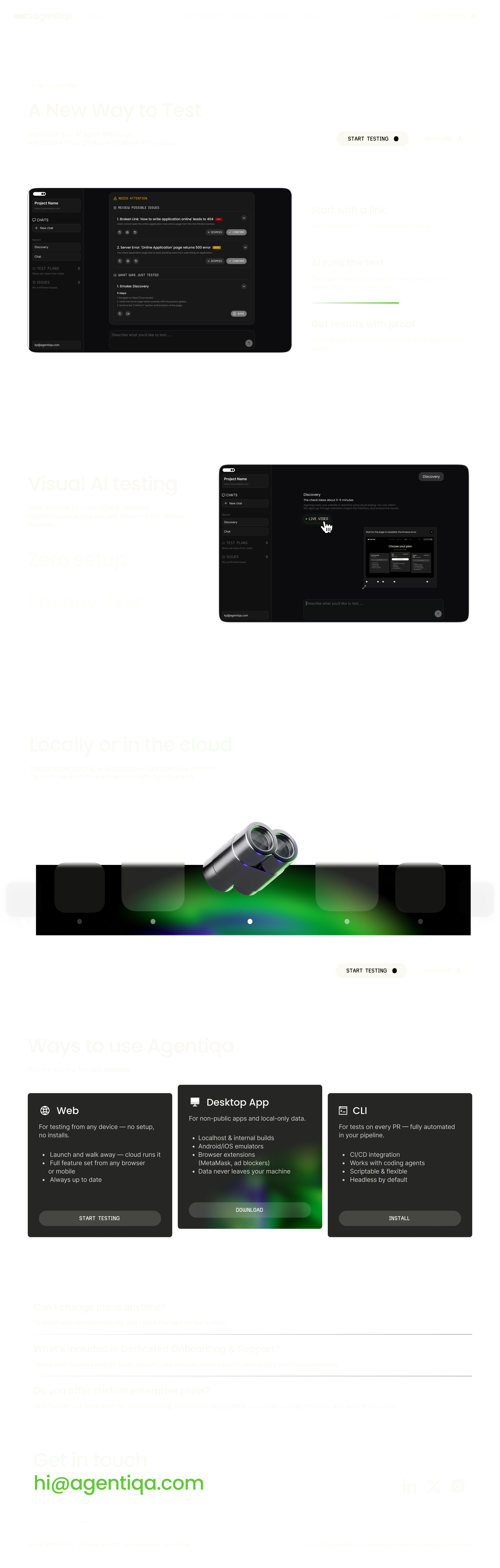

From idea to pull request
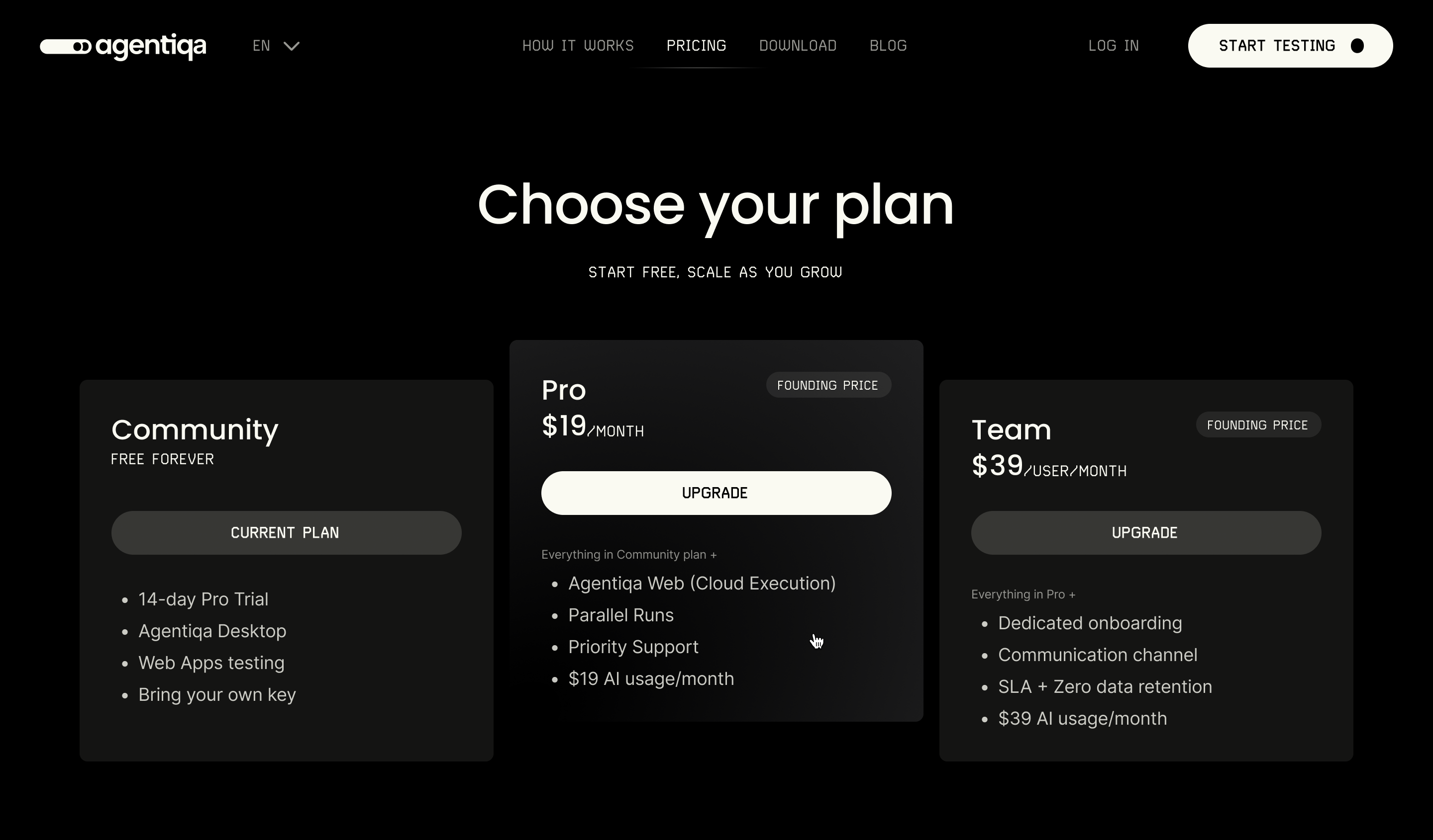
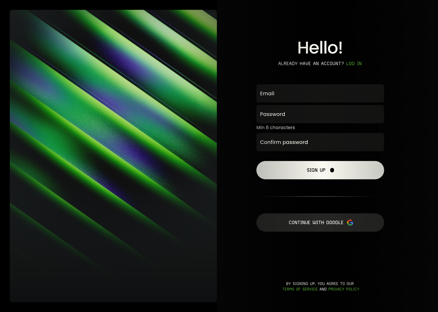
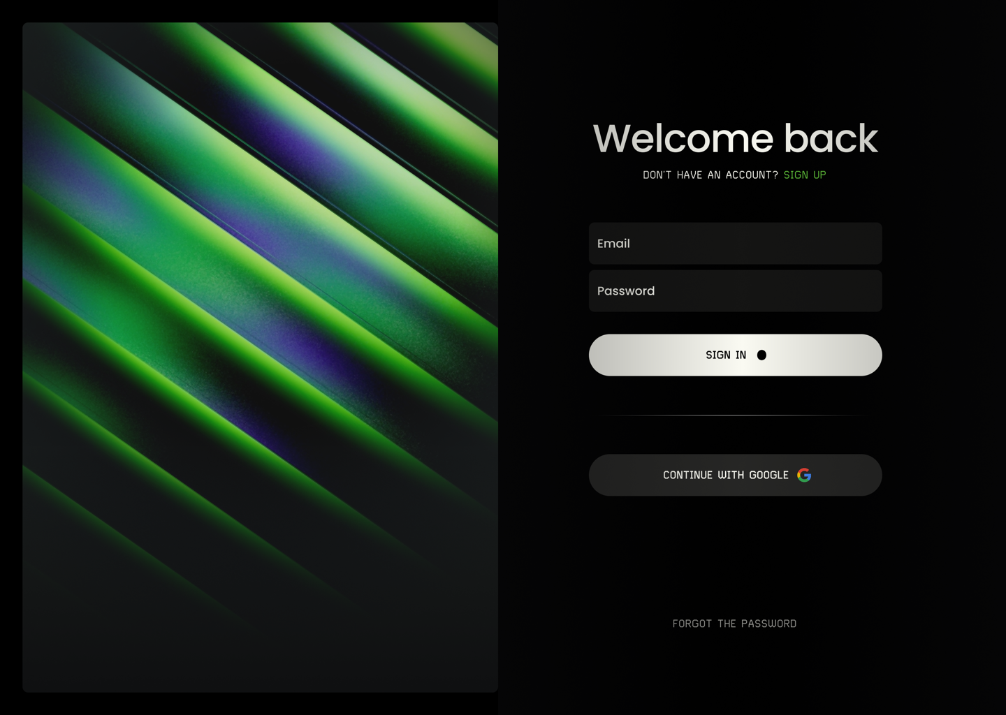
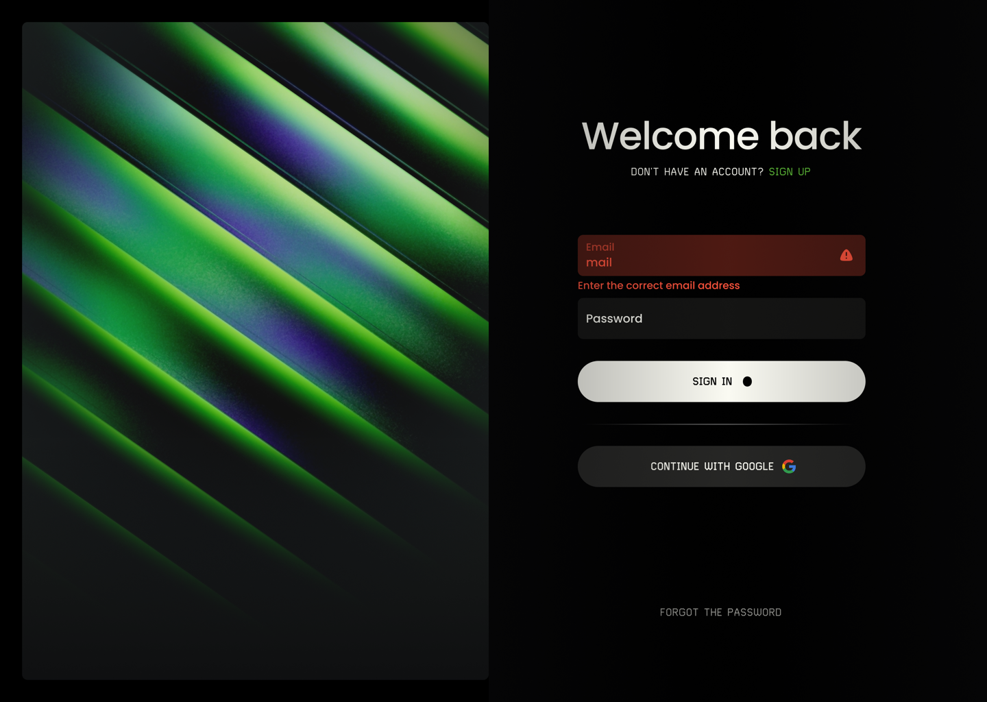
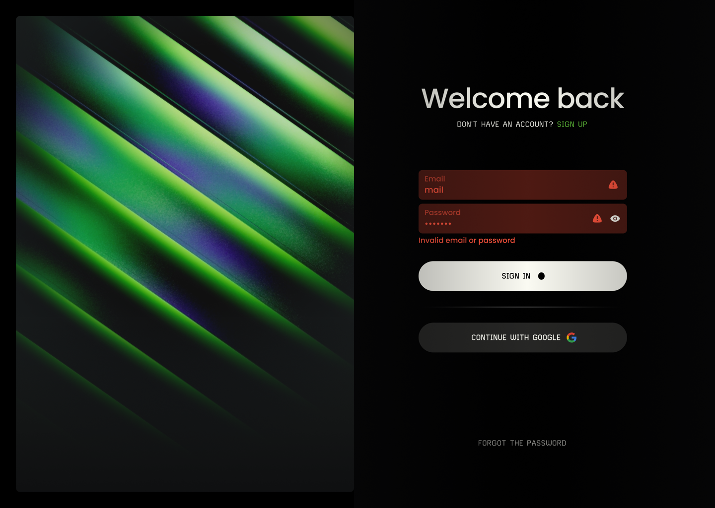
One dark, quiet foundation for the website: a compact token set, mono labels for actions and components that cover every state — from hover to error.
EN
How it worksPricingDownloadBlog
Download Start testing
EN
Start testing
05 — 3D graphics system
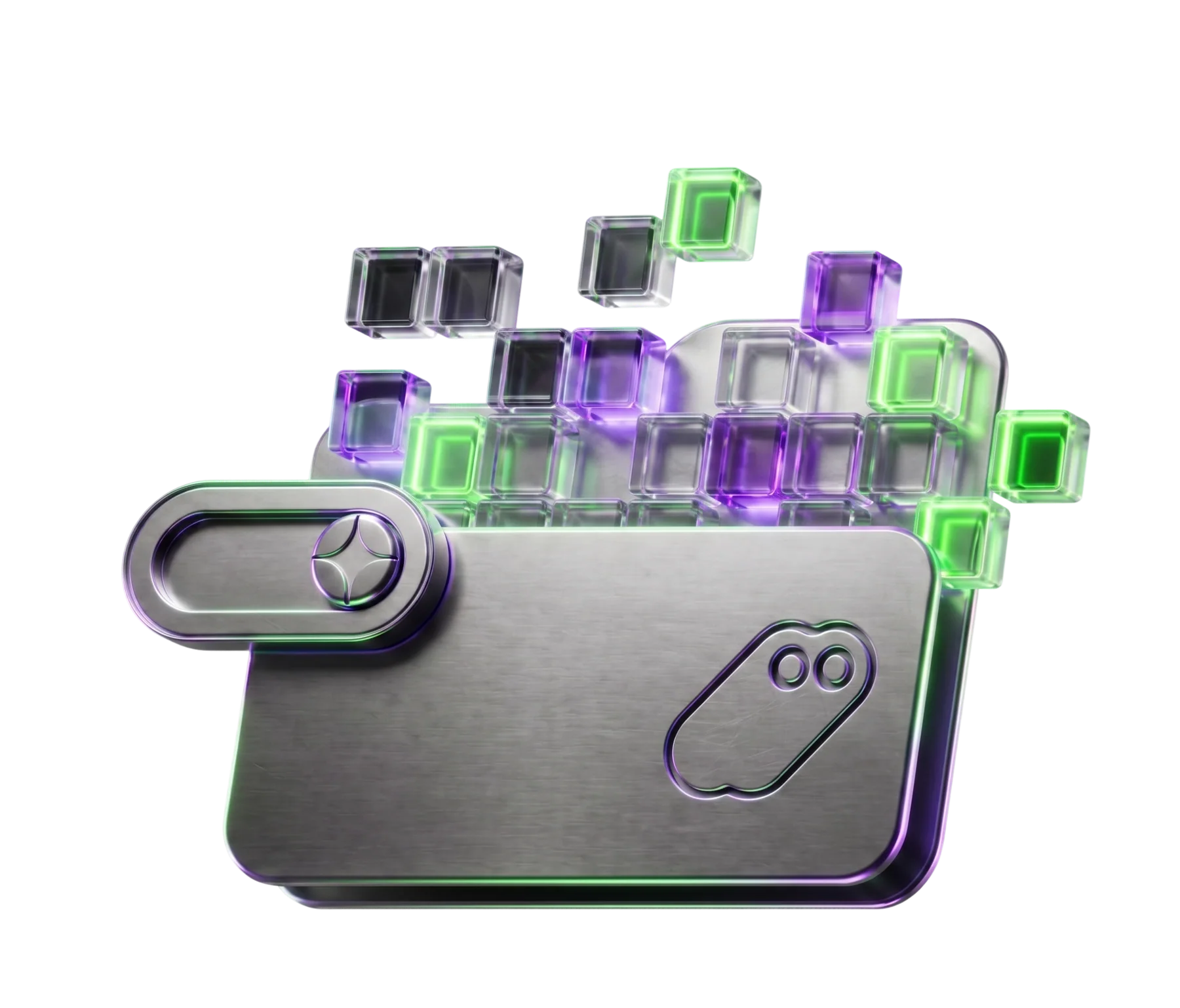
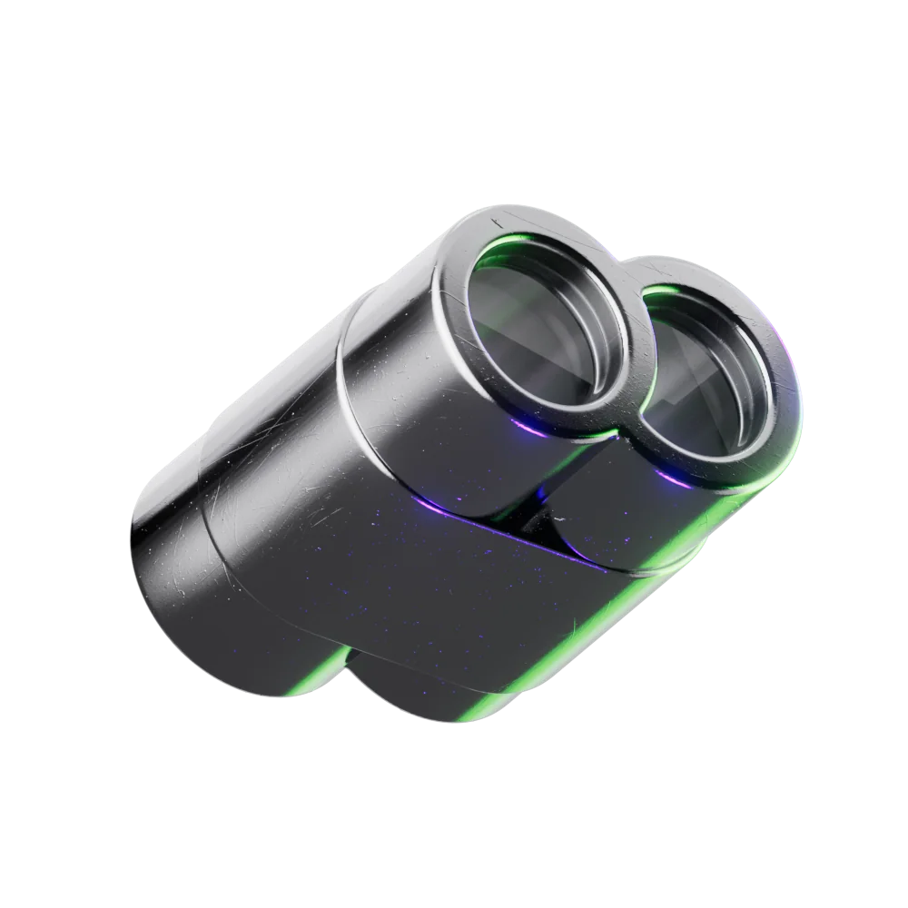
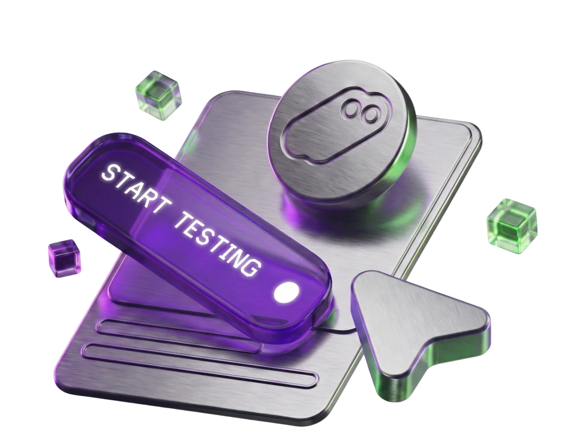
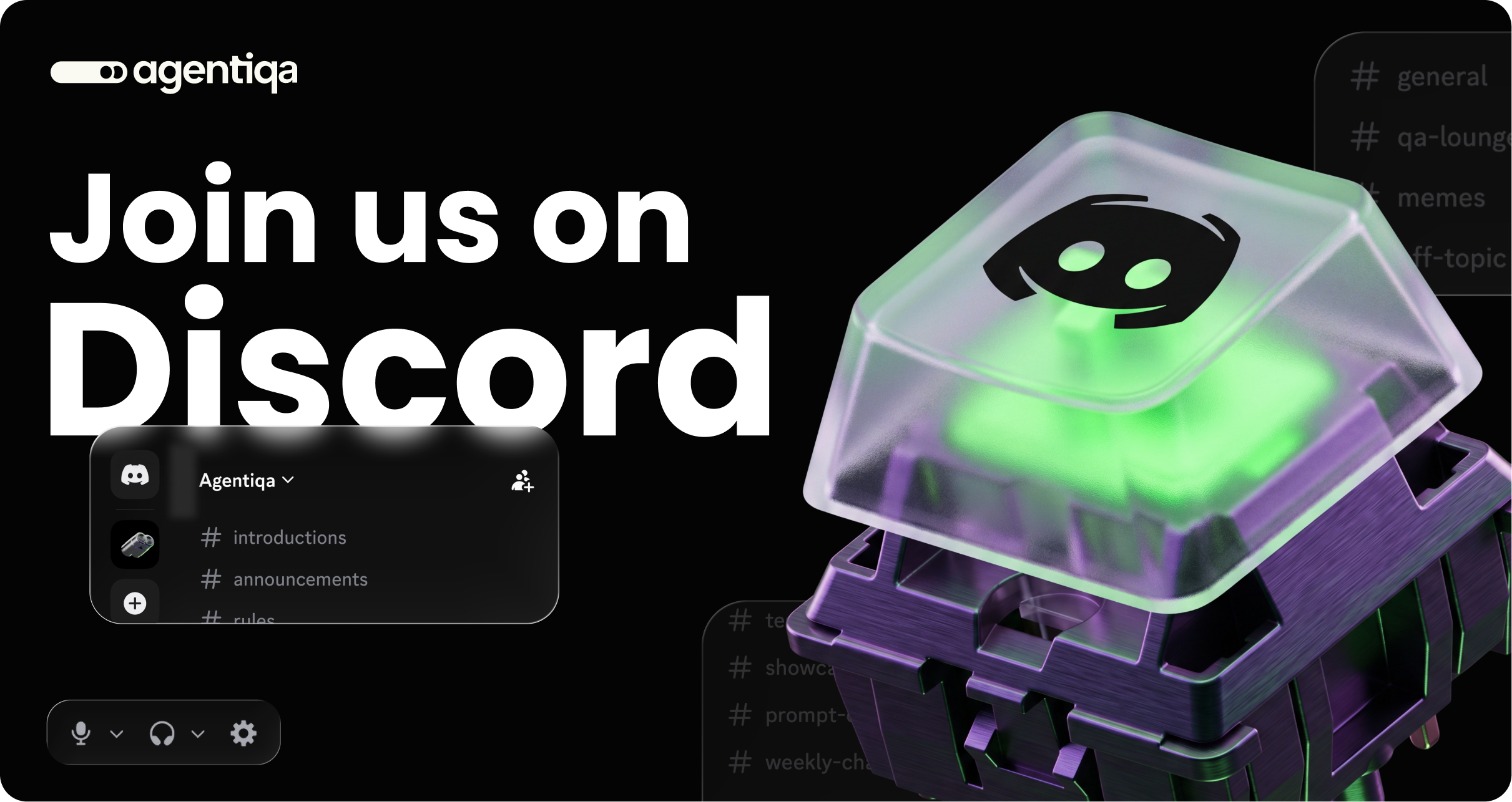
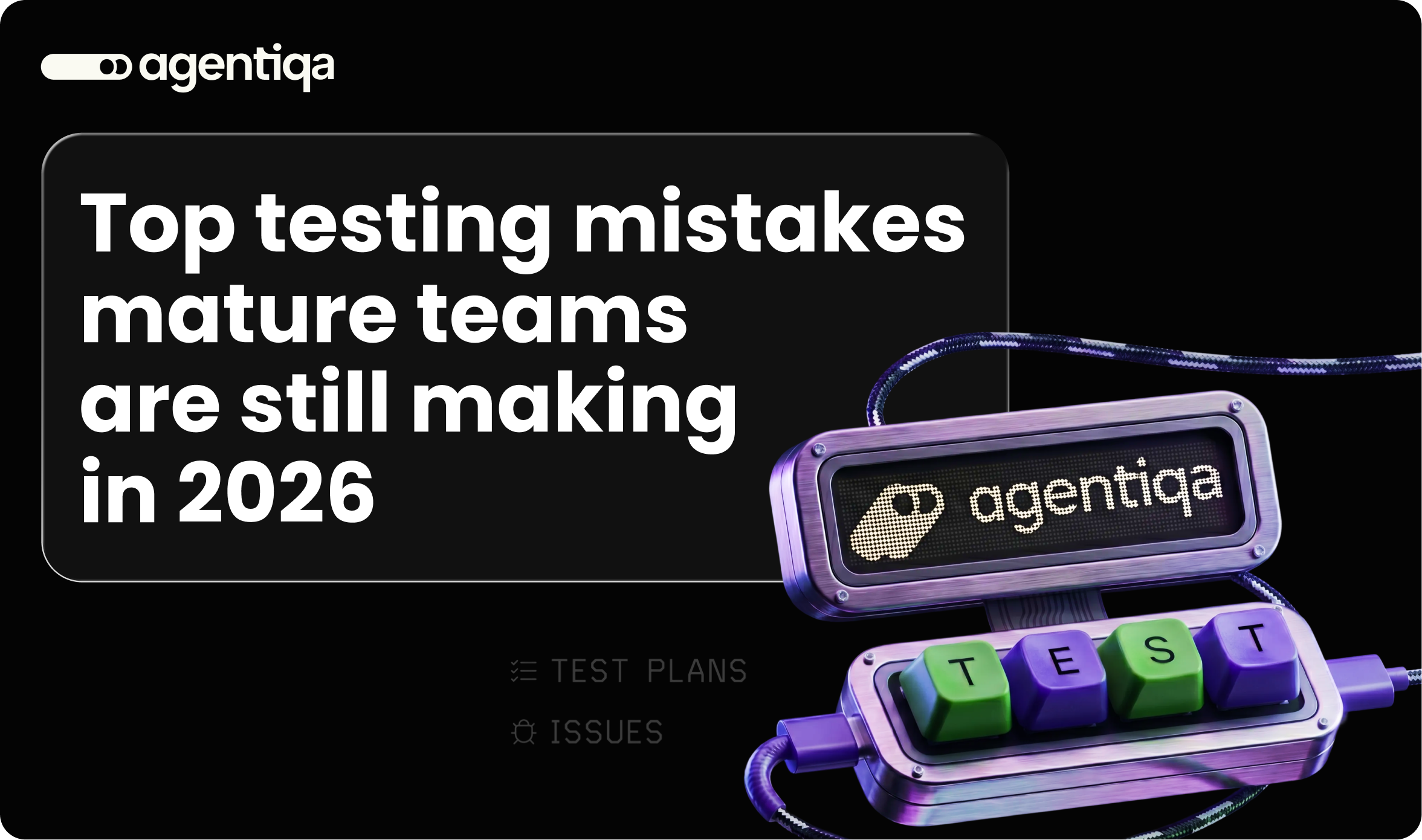
I built a 3D graphics system for Agentiqa and adapted it for the blog and communication. One set of materials and light — so anyone on the team could ask for a new cover or banner and it would still look like Agentiqa.
06 — Product design
Interviewed users and analysed their feedback to find where people got lost.
Designed user flows and interfaces for the whole product — web, desktop and CI.
Tested different solutions with users and the founders, and improved the design.
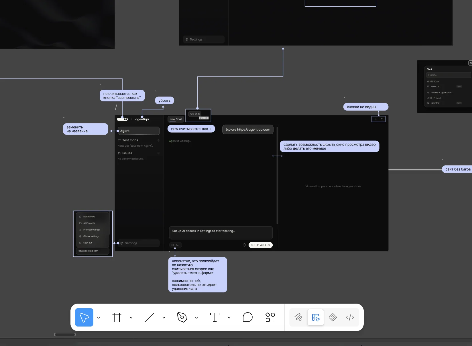
UX problems found in interviews were pinned right on the screens — “unclear what happens after the click”, “let users hide the video and keep reading” — and fixed screen by screen.
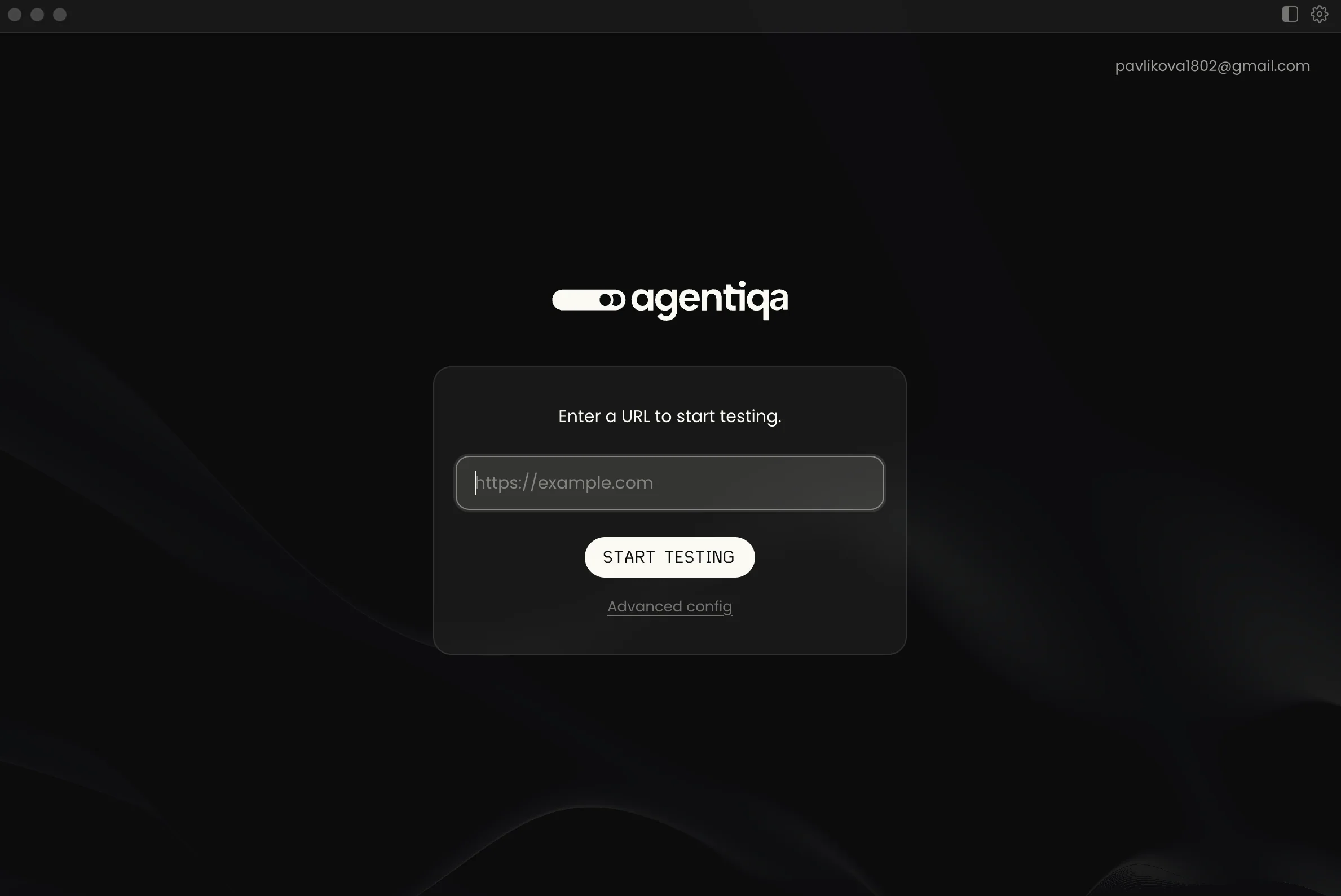
I redesigned the product screen by screen: clearer structure, simpler main flows, one consistent interface.
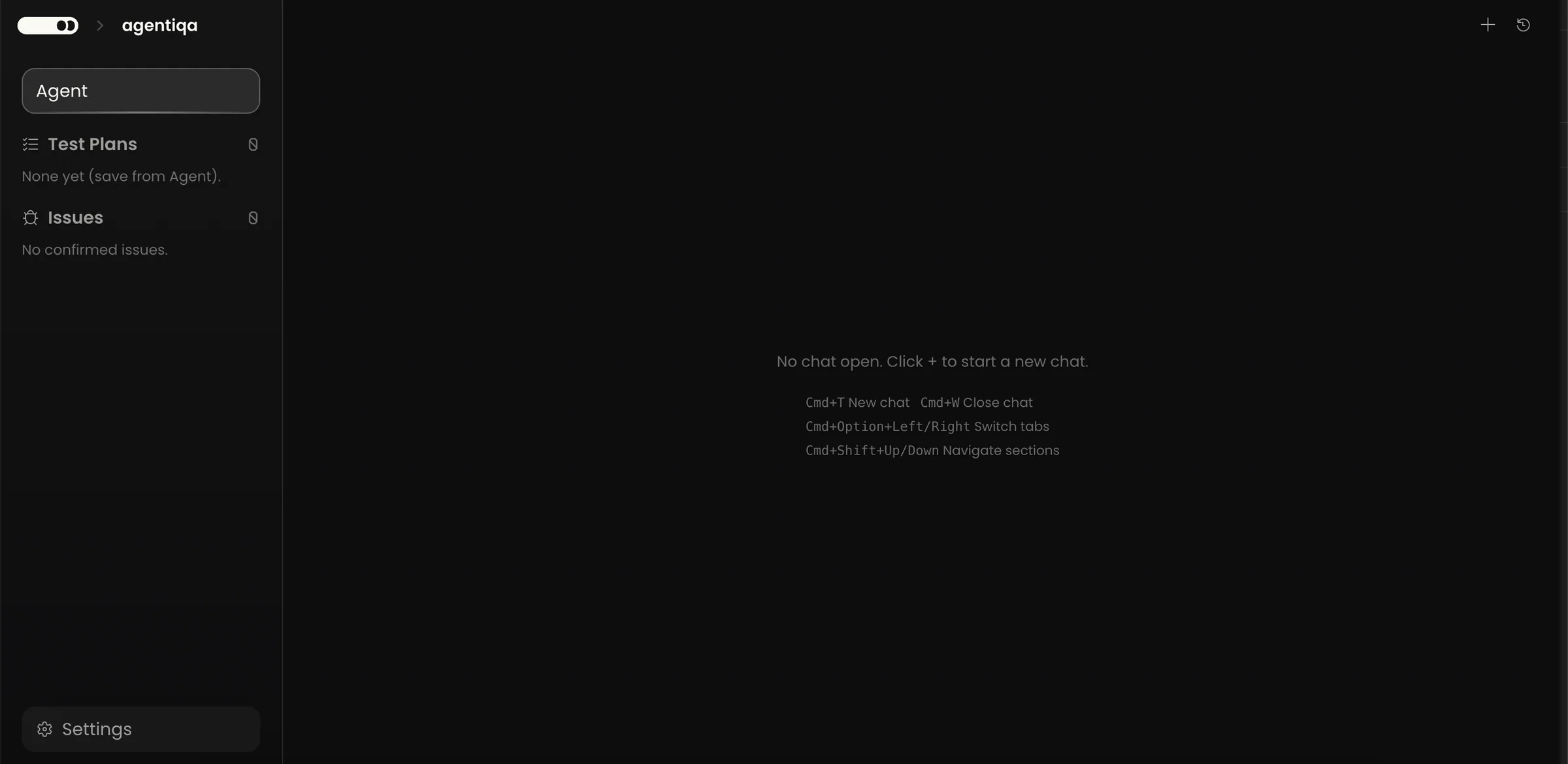
Hey! What are we testing?
Before: an empty screen with keyboard shortcuts. After: one question and one field — the first step is obvious.
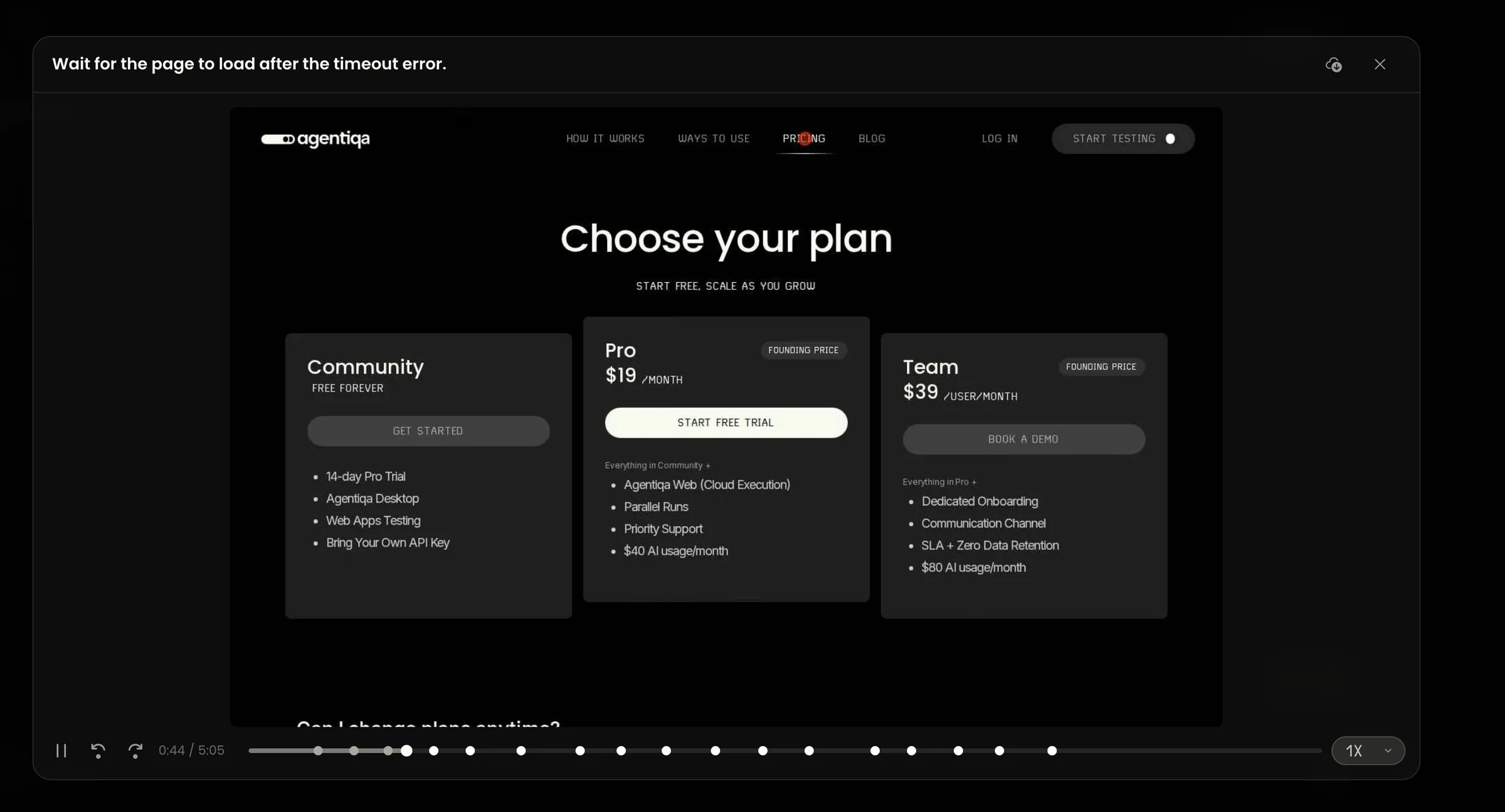
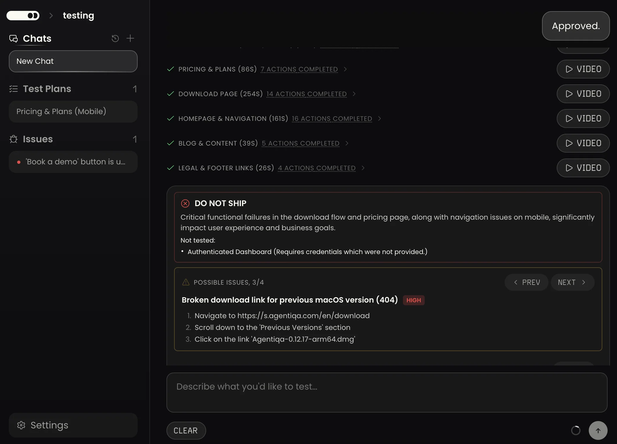
Test result:
⚠ Needs attention
Critical failures — a 500 server error and 404 broken links make the “One Window” services unusable.
Review possible issues
1. Broken link: “How to write an application online” leads to 404High
Users can’t open the instructions page from the One Window section.2. Server error: “Online application” returns 500Medium
The page fails to load, blocking users from submitting an application.What was just tested
1. Smoke: Discovery9 steps
Save2. Home page6 steps
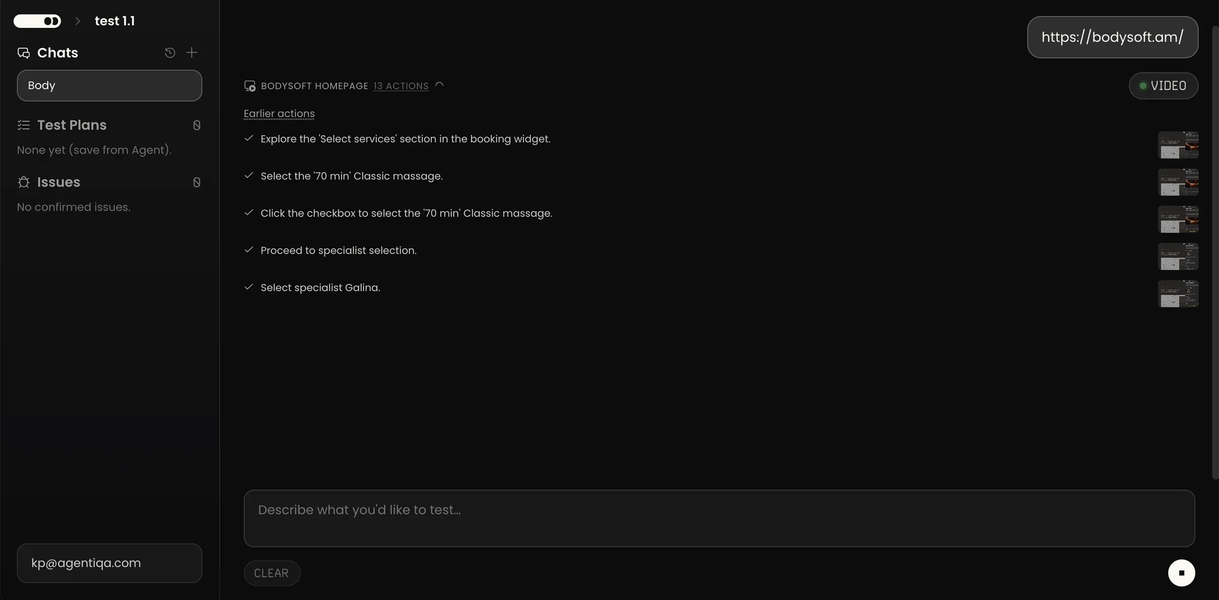
SaveBefore: everything at once. After: a verdict first, then issues to confirm or dismiss, then what was tested — ready to save as a plan.
Result
From a working engineer-built tool to a product with one voice — brand, website, graphics and 60+ screens, ready for launch.